Monday 26 May 2014

Roy Lichtenstein - Essay


Benjamin Day is a printer and Illustrator, whom the Ben-day printing is named after. The process of the Ben-day printing is very similar to pointillism. It has a technique of dot placement which varies depending on the effect needed. The dots could be closely spaced, widely spaced or overlapping. 
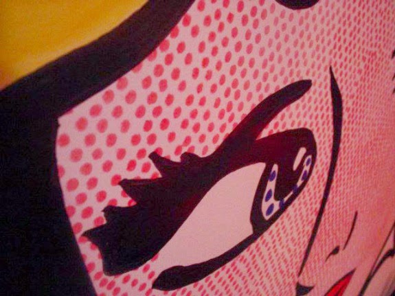


To create a pink colour for example Magenta dots are printed widely spaced. 


Magenta, Yellow, black and cyan were used to create secondary colours, such as green, orange and purple. This was the four colour process of ben-Day, used by pulp comics in the 50's and 60's. 


Ben-day dots are different from half tone dots in a way that Ben-Day dots never vary in size and distribution of specific area. Transparent overlay sheet bought by the artist is used to apply the dots to the drawing. These sheets gave the artist a great range of tone for his work as the sheets were available in a wide variety of size and dot distribution. These were cut as desired into the overlay material for example shadow, background or surface treatment and it is rubbed using a burnished, onto the specific areas of the drawing.

The areas of Ben-Day overlay provided the painting plate with tonal shading, especially when it is photographically reproduced as a line-cut for letter press printing.  


Drowning Girl presents "a young woman who seems to have cried herself in a river. Literally drowning in emotion," The scene looks clear that she has been hurt and crying. Exaggerated to a point that the tears are turned into a sea.

Lichtenstein style, the sad female is presented "in a suspended state of distress”. She looks like resting on the wave and water instead of floating and swimming which shows a mixture of  "eroticism and final resting place". The waves seem to be continuously moving around her.  The painting shows a lot of emotions such as sadness, darkness, loneliness and fear. 


Roy Lichtenstein was the example of an artist whom, the Ben-day dots were considered a trademark of. Especially in his interpretations of contemporary comic book on magazine images. He enlarge and exaggerated them in many of his sculptures and paintings. Other artists and graphic designers have used enlarged Ben-Day in print media.

Lichtenstein used other techniques and material, apart from Ben-Day dots, as his media. Other techniques used by him were;

Gesso, which is usually made using a ready made mixture of a Paris and glue plaster. The acrylic version of this technique is used by todays artists. Apart from giving it a uniform while appearance, it's purpose is to prevent the canvas from absorbing to much water.

Lichtenstein also liked to use Magna, a specific type of acrylic, because it could be easily removed using a spirit  and out of most of the water based acrylic is the one that shows the best colour. 

For a  slik-screening print, an artist puts a stencil on a stretched piece of silk then puts a paper underneath the silk. He then draws the ink across the top of the silk by using a squeegee, a type of rubber and wood paddle. This process is also known as Serigraph.

A woodcut is when ink is applied to a carved block of wood and through this process a print is created. 


These two pictures resulting of a commentary inspired by comic style. On the right, one can already notice it’s Lichtenstein work.  And the other is by Tony Abruzzo.

Roy Lichtenstein is the most famous pop artist during the sixties, especially well known for his comic-strip paintings of his comic books. Both looks very similar. Colours are bold, lines are dark.
He used the woman, in “Run for Love” to capture the illusion that she’s about to drown and a guy looks to be on the way to save her.

On the other hand, Abruzzo created the style of the background same as Lichtenstein. One can see a man who is being chased “By the bad guy” for what seems to be a copy of something held tightly in his hands.

Both of the comic pictures have use of thick lines, bold colours, thought bubbles and boxed captions which were often included in comic books.

Nowadays this Be-day effect technique is still in use in the form  of  Colour Halftone filter found in Adobe Photoshop. 


Maggie Burgan. 2009. Roy Lichtenstein Ben day dot technique. [ONLINE] Available at : http://www.awdsgn.com/classes/fall09/webI/student/trad_mw/burgan/final_project/pages/technique.html [Accessed 26 May 14 ]


Scott Edelman. 2013. Another reason I love Dave Gibbons (and continue to hate Roy Lichtenstein). [ONLINE] Available at: http://www.scottedelman.com/2013/04/12/another-reason-i-love-dave-gibbons-and-continue-to-hate-roy-lichtenstein/. [Accessed 19 June 14].

Melissa Evans. 2014. Pop Art Inspired by Lichtenstein . [ONLINE] Available at:http://www.melissaevans.com/tutorials/pop-art-inspired-by-lichtenstein. [Accessed 19 June 14].


2nd Visit Exhibition

This exhibition is done by Marisa Attard which is located in St.James Cavalier. She’s an artist and illustrator who lives on the island of Malta. Her work often reflects the bright light and colours that are part of the Mediterranean climate. Her sense of humor comes through in her paintings of people who live the world she kneel observes. The subjects of her paintings range from the humorous and original to the dark and serious. The medium that she used is acrylic paint on a textured gesso bade coupled with collage of various papers, materials and found objects that ass a certain tactile quality and depth to her paintings.


"Tombola"

The first painting is about 3 oversized women, sitting on a bench. The saturation of colour is high with an intensity blended. It’s a warm painting. One can notice the mood of an argumentative woman between them. It’s a two-dimensional scene with a pinterliness. In my opinion, I don’t like it that much because of the characteristics of each woman. 

"Tickle"

The composition of this painting is showing us the winter season. This time, the colour is cool with a front light appearance. I like this painting because of the mood in which something has happaned and the au look. 


"Bar Code"


This is an interesting piece. I loved the background and the combination of two patterns. The characters makes the picture pop out more. Each character shows a different expression. The mood is balanced with calm and staring at the same time.  


"A perfect Balance"

This is my favourite painting, from this collection. I really like the proportion of the size. It’s a tall effect with a vibrant colours. I image this painting into a fancy restaurant. 


"Pastizz"


I also like this painting. As one can notice, the artist likes to create, a character with a thin long legs. There’s the use of primary and secondary colours. At the bottom, there’s a rough surface texture combined with a high saturation. 


1st Visit Exhibition

This was the first exhibition of this year. These paintings are done by Noel Attard which where presented in a Cavalieri Art Hotel in St.Julians. I was passing by and I noticed these amazing paintings hanging on the wall. The artist transforms reality as seen through the physical eye into surreal scenes of elegant and sensual beauty full of fantasy and imagination. He is inspired by nature and metamorphoses.

Theres a sense of shapes and ghostly pastel shades, earthy colours


"Grigal"


This Painting is divided into 3 sections. I really like this style. It’s ideal for a modern style to decorate in the house. Theres a selection of blues with a dark tone. It’s a cool quality with a rough dull texture. I think its an interesting piece, also a different technique of using 3 pieces of canvas to experiment more the shapes.


"Blue Valletta Skies"

Although, the artist likes nature, one can see the paintings emphasis on the earthy colours. This time, he added the green, white and a touch of red to compliment more. It’s a wide scene with a two-dimensional broken lines. It has a rough texture. Personally, the reason I like this painting is because one can express the mood by looking at it.


"Tramuntana"

It’s a confusing picture. There’s the brush stroked texture which resulting the picture rough and dull. The lines are strong, especially the white ones, which gives the boats as linear look. It’s a classic piece of art.

"Siggiewi Church"

This is my favourite one so far. I really love the colours with a combination of high and low saturation. The intensity varies according to the sourrounding colours which blends carefully and with thoughts. One can see the linearity of continous strong lines. 


"Game of life"

This time, Noel added more contrast of colours such as black and white. It has a classy look. There’s the symbol of the chess in the middle which is combined with the continuous strong lines. As the previous paintings, one can see, the blue colour again applied which leave a cool effect. I don’t like it that much, It’s too busy. 


Thursday 22 May 2014

Art Nouveau

Art Nouveau, or the French term for “New Art,” is a colorful movement in the arts that captivated Europe during the transition from the 19th century to the 20th century. In other languages, Art Nouveau had other names, such as “Stile Liberty” in Italy and “Jugendstil” or “youth style” in German. 

An early example of the paintings of Art Nouveau is Edvard Munch’s “The Scream.” This painting was created in 1905 and later displayed during the artist’s first Paris show at La Maison de l’Art Nouveaux gallery. This location was the interior design house for which Art Nouveau is named. Now “The Scream” hangs in the National Gallery in Oslo, Norway.


Edward Munch is a Norwegian Expressionist pointer who carried out four versions of “the Scream”. Two, which are located at the Munch Museum in Oslo, are moderated on paperboard. Another is oil moderated and pastel, located at the Gallery of Oslo and the fourth version, dating back to 1895 is in a particular collection, bought by Sothe in New York on the 2nd of May 2012.

This work is regarded as the most important by this artist.

“The Scream” belongs to a large collection of 22 paintings. He seeks to fix moments of emotions on his painting as on a photographic plate. The portrait of a face, sometimes compared to a mummy, is deformed by the force of the cream. The face lengthens upwards whilst swelling, and the horizontal movement moves the level of the sky. Tension is added with the help of contrast between warm and cold colours.

The point of view of the viewer is at the top of the head of the figure, the point where the distortion is projected out of him.

The face of the figure is directly between two vertical tension fields and between two points of interest. The glowing sky is located to the top of him and the blue and orange colours used seem to dispute pictorial space and make the viewer think they are in competition between each other, showing day and night or the calm and the anguish. 


Edward Munch,The Scream,1893,expressionnism,analysis and study of the picture and style,art,culture,painting. 2014. Edward Munch,The Scream,1893,expressionnism,analysis and study of the picture and style,art,culture,painting. [ONLINE] Available at: http://www.painting-analysis.com/the_scream.htm. [Accessed 22 May 2014].

Vincent Van Gogh


Born at Groot-Zundert, the Dutch Painter was influenced by the Hague school and English illustrator artists. Anton Mauve encouraged him to paint his first water colours and oils He painted farmer subjects and landscapes in sombre earthy colours.

In 1886 he moved to Paris to join his brother Theo and entered the Atlier Cormon, where he met Toulouse Lautrec and Bernard. Japanese prints, Impressionism and Neo-Impressionism where his main influences.

He achieved his full mature style when he moved to Arles. In December of the same year, he was joined by Gauguin, but violence between them led to his first mental breakdown, and to Gauguin’s departure. Shortly after, he was admitted to the Asylum of St Remy, where violent attacks, followed long periods of lucidity.


In May of 1890 he was under the care of Dr Gachet, at the Auvers-Sur-Oise, where he committed suicide two months later.


Thatched Roofs

1884


This depicts a group of cottages at Neunen in Brabant. The cottages are similar to a group that appear in an oil painting known as 'Village at Sunset'. Van Gogh mentioned this and two other drawings in a letter to a friend, the painter van Rappard, as an example of his recent work. Of one of them, he said, 'I had to do it roughly and quickly for the time was rather short for catching the right effect of light and shade, and the tone of the scene, and Nature as it was at that very moment.' The wintry scene of this drawing relates it to a similar drawing described to van Rappard in a letter of March 1884.


A Corner of the Garden of St Paul's Hospital

 at St Rémy – 1889


There is no mention of this drawing in van Gogh's letters. Its very twisted, writhing forms suggest that it was made at the time van Gogh was staying at the Hôpital St Paul at St Rémy. It appears to be a view of the hospital garden itself. The irises in bloom in the bottom left-hand corner suggest it was made in the early summer. Van Gogh was at St Rémy from 8 May 1889 to 16 May 1890, which suggest this was probably drawn in about June 1889.

Farms near Auvers 1890


A view at Auvers-sur-Oise, a small town just north of Paris. Van Gogh spent the last few months of his life there, from mid-May 1890, when he left an asylum, to his death on 29 July. At the beginning of June, Van Gogh wrote to his sister: 'there are some roofs of mossy thatch here which are superb and of which I shall certainly make something'. This picture, which is unfinished, was probably begun soon afterwards. Painted direct from the motif, it shows how Van Gogh transformed what he saw into something entirely personal, using a vigorous brushwork and curving outlines to express an unsettling vitality and energy.

Ronald Alley. 2014. Artist Biography Vincent Van Gogh. [ONLINE] Available at: http://www.tate.org.uk/art/artists/vincent-van-gogh-1182 [Accessed 26 May 14].

Marcel Breuer


Marcel Brauer was an architect, designer and teacher who was born in Hungary. He studied at the Bahaus school of design in Germany, where later he also practiced architecture. He left to England in 1933, after the rise of the Nazi party, before going to America four years later . There he helped develop the school of architecture at Harvard University. Between the 50’s and 60’s he designed a number of building in Europe and the U.S. Brauer’s buildings are usually made of simple blocks in rough, unfinished stone or concrete and wood.


Cesca Chair


After designing the Wassily Chair Breuer designed the Cesca Chair. Cesca chair, named after his daughter Francesca, combines of user-friendly caning and hardwood Beech with the industrial-age aesthetic of cantilevered tubular steel. Functional, simple and modern. Cesca chair has no legs and it relies on supporting from the rigid properties of steel tubing. It uses non-reinforced steel tubing, thereby creating a free-swinging chair that came close to his idea of "sitting on columns of air."


Wassily Chair


The Wassily Chair, also known as the Model B3 chair, was designed by the head of the Bauhaus Marcel Breuer in 1925-1926. It was later named as the Wassily Chair after a story about Breuer’s friend and colleague at Bauhaus, Wassily Kandinsky.  After first producing the Model B3 Chair prototype, Kandinsky was so enthralled with the chair that Breuer decided to produce another for Wassily Kandinsky himself.  This friendship, and the later popularity of Kandinsky led the producers of the Model B3 Chair to change its name to the now famous Wassily Chair. Marcel Breuer found his inspiration for the chair in the bent form of a bicycle handlebar, available for the first time in steel due to a development in technology. The German steel manufacturer Mannesmann had developed a process to produce seamless steel tubing, the first to allow tubes to be bent without breaking at the seam.  Breuer’s Adler bicycle featured such tubing, which inspired the designer to employ this material in furniture. In the beginning, It was produced in both a folding and a non-folding versions. In this early iteration, the straps were made of fabric, pulled taut on the reverse side with the use of springs. And re-introduced version was available in hard leather.

Steel Classics. 2011. Cesca Chair. [ONLINE] Available at: http://uk.steelclassic.com/marcel-breuer-cesca-chair.html. [Accessed 21 May 14].

Dada

Dada began in Zurich and became an international movement. Or non-movement .Dada had only one rule: Never follow any known rules. Dada was made to provoke and shock the viewer. If its art couldn’t offend traditionalists .Dada art is senseless to the point of being almost crazy. Almost all of the people who created it were very serious. Abstraction and Expressionism were the main influences on Dada, followed by Cubism and, to a lesser extent, Futurism. There was no main medium in Dadaist art. All things from geometric carpets to glass to plaster were accepted. It's worth noting, that collection, collage, photomontage and the use for objects which were already made, all were accepted because of their use in Dada art. For something that meant nothing, a lot of things grew from Dada. Dada influenced many trends in the visual arts but the best-known movement Dada was responsible for is Surrealism. Dada self-destructed when it was becoming "acceptable".


The Dadaists used a form of shock art and pushed mild rudeness, visual jokes and everyday objects renamed as "art" into the public eye. He performed one of the most famous outrages by painting a moustache on a copy of the Mona Lisa and proudly displaying his sculpture entitled Fountain. 


Mona Lisa


L.H.O.O.Q a cheap postcard-sized reproduction of the Mona Lisa which Duchamp drew a mustache and a goatee. The “readymade” done in 1919, is one of the most known act of degrading a famous work of art. The title when pronounced in French, puns the frase “Elle a chaud au cul”


Fountain


A man of great humour and wit, Duchamp loved jokes and challenging others to think beyond unoriginal wisdom. He is best known for introducing the ready-made (or “found”) object into visual art, co-founding Dada and being associated with the Surrealists. Perhaps his greatest contribution, is that he almost alone, shifted the focus of art away from the strictly visual and onto the mental. Duchamp had a large impact on Contemporary Art.


Shelly Esaak. 2014. Art History. [ONLINE] Available at:http://arthistory.about.com/cs/namesdd/p/duchamp.htm. [Accessed 21 May 14].